
User-first start
Shoppers get lost when signs fight the space. Good wayfinding puts people first. That begins with clear cues, short sightlines and simple pictograms. Public spaces borrow solutions from public transport — see public transport signage — because transit systems solve scale and density every day. This article looks at how custom-molded retail wayfinding reduces hesitation, speeds routes, and eases staff load.

The real problem
Stores create decision points. Endcaps, crossings and multiple levels add friction. Pedestrian flow stalls at unclear junctions. Customers pause. Dwell time rises. Revenue leaks. The core issue is legibility: can a person read and act in under two seconds? Fix that and you reclaim lost movement.
Design rules that work
Design for glance. Large type. High contrast. Icons that match culture and context. Use wayfinding hierarchy: primary direction, secondary detail, tertiary info. Keep copy to a few words. Maintain consistent pictogram style across the footprint. Line-of-sight matters — signs must be visible before a decision point. These are practical moves, not theory.
Materials and fabrication
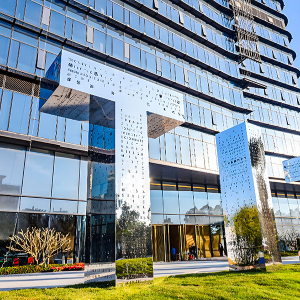
Custom molding lets designers shape signs to sightlines. Low-reflective surfaces reduce glare. Tactile surfaces help accessibility. Durable finishes hold color and contrast longer in heavy traffic. Think modular assemblies so signs can adapt during promotions or seasonal layouts. This saves downtime and keeps legibility intact.
Testing and real-world anchors
Test with people. Walk the route with store staff, delivery teams and first-time visitors. Observe hesitation spots. Measure time-to-decision. Transport agencies teach this: Transport for London standardized legibility and pictogram use to improve passenger flow decades ago — a practical model. The 2012 London Olympics also proved that a unified signage plan moves crowds safely and quickly. Use those lessons when you prototype.
Common mistakes
Many teams over-label. Too many arrows. Small type. Poor mounting height. Signs that blend with shopfronts. Avoid jargon. Avoid excessive branding on directional pieces. Branding can be present, but not dominant. — Designers sometimes hedge; keep the goal visible and simple.
Alternatives and complements
Digital wayfinding can help but often fails without strong physical anchors. Floor inlays and ceiling blades both work. Audio prompts assist visually impaired users. Combine static signs with simple digital panels for temporary changes. When budgets are tight, prioritize primary routes and key decision points.
Measurement and iteration
Set three live metrics: time-to-decision, wrong-turn rate, and queue length at choke points. Run A/B tests across aisles or store weeks. Collect staff feedback weekly for the first month after install. Use that data to refine sign placement, copy and pictogram scale. Good transportation signage supports iterative improvement and long-term clarity.
Summary of insights
Custom-molded wayfinding wins when it solves a real user moment: the split-second choice. Focus on glanceable information, consistent pictograms, and durable materials. Prototype in place. Measure simple metrics. Borrow what works from transit practice. The result is smoother pedestrian flow and fewer staff interventions.
Three golden rules
1) Prioritize legibility: goal is instant comprehension at decision points. 2) Validate in situ: test with real users and measure time-to-decision. 3) Build modularity: allow quick swaps for promotions without losing hierarchy. Use these as your checklist when choosing systems and suppliers.
Final thought: practical clarity wins every time — Cosun Sign brings that into physical form. –